A little flashback.
I discovered the Tandem app during the COVID era, when staying at home for long periods started to feel frustrating. I wanted to do something productive, or at least something new, and that’s when I found Tandem.
Tandem lets you learn a language by talking directly with native speakers. You can chat, join calls, exchange cultures, and slowly build confidence speaking with strangers. What made it special for me was the human connection.
You don’t just see beautiful photos of other countries on social media, you actually talk to people who live there. You learn about their food, traditions, and daily life, and in return, you share stories about Indonesia (and yes, remind them it’s not just Bali and Jakarta).
How Tandem works.
After signing up, you select:
- Your native language
- Languages you’re fluent in
- The language you want to learn
Based on that, Tandem shows a list of people who match your learning goals. In the early days, users could display multiple language badges on their profiles. Now, unless you’re a Pro or Premium user, you can only choose one language per category (native, fluent, and learning).
Tandem is available on iOS, Android, and the web. If you just want to chat without staying glued to your phone, the web version works well. The UI and UX across iOS and Android are mostly similar, with nothing drastically different. I said that, after using Tandem for almost six years, I’ve started noticing some small but interesting UX details.
Tandem Party feature
One of Tandem’s most interesting features is Tandem Party, a group call feature where users can join live conversations. It’s quite similar to X Spaces: there’s a host, speakers, and listeners.
However, there are a few differences:
- No anonymous listening option
- Non-premium users are limited to 1 hour of listening per day
iOS vs Android UX differences
From my experience:
- On iOS, joining a party feels smooth. I tap once, and I’m in.
- On Android, there’s sometimes a slight delay or the tap doesn’t register, so I end up double-tapping to join.
Another interesting detail is the filter behavior on the Party page:
- On iOS, the filter resets after joining or leaving a party. You have to reselect the filter and scroll again.
- On Android, the filter stays active, which actually feels better.
So, in a way, both platforms have minor UX issues, just in different places. Hopefully, these small frictions can be improved in future updates.
Below is a simple UX comparison showing the current flow and a proposed alternative for joining a Tandem Party.
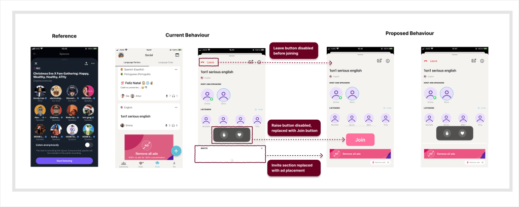
A small UX idea: “Join” before entering
This got me thinking, what if Tandem added a manual “Join” button, similar to X Spaces? Currently, tapping a party immediately takes you inside the room. But sometimes:
- I’m not interested in the topic
- I don’t feel like joining that specific group
- I just want to preview and leave
A join button would allow users to exit without entering first, reducing accidental joins and awkward exits. Since Tandem already shows ads, another idea could be placing banner ads inside the party room, without disrupting the core experience.
Final thought
Overall, Tandem is a great alternative to apps like Duolingo, especially if you want to learn a language directly from native speakers.
—
If you need a +1 on something you’re building, I’m in.
