Category: Products

  • Fraud Detection: Identify Risky User Behavior Before It Costs Your Business

    Fraud Detection: Identify Risky User Behavior Before It Costs Your Business

    I want to share some common fraud behaviors I’ve encountered in my work.

    I’m on the operations side, where my main responsibility is monitoring the platform and user activity. Day-to-day, my job is to observe what users are doing, identifying whether their behavior is normal or suspicious, and spotting early signs of fraud.

    Many applications offer benefits to users, but those benefits always come with the risk of abuse. The question is: what happens if your company doesn’t have a person or team dedicated to handling this kind of behavior?

    Fraud doesn’t just affect operational costs. If your platform also serves clients, you act as a bridge between users and those clients. Once fraud slips through, you lose client trust, and that’s much harder to recover than money.

    If you’re a solo founder or running a small platform without a dedicated security or fraud team, you can still take preventive steps. Even if you’re not a developer, you can request basic safeguards to be implemented.

    Below are some common fraud patterns I’ve seen, hopefully, they help you avoid the same mistakes.

    1. OTP abuse (SMS or WhatsApp)

    If your platform uses OTP via SMS or WhatsApp, always set limits:

    • Limit how many OTP requests a user can make per day
    • Add a cooldown time between OTP requests

    A normal user usually needs no more than 2–3 attempts. Rarely more than 5. Fraudulent users, on the other hand, may request OTPs hundreds or even thousands of times, intentionally draining your SMS or WhatsApp credit. That directly hits your operational cost, and it adds up fast. Set limits. Always!

    2. Promotion, benefit, or reward abuse

    If you offer promotions or rewards, your rules must be very clear.

    Otherwise, don’t be surprised if:

    • A promotion meant for 1,000 real users
    • Ends up being redeemed by 200 real users and 800 fake accounts

    Why does this happen? Because one person can create multiple accounts to redeem the same benefit, especially if your system only checks a single unique ID.

    If you want rewards to reach real, genuine users, consider adding prevention checks such as:

    • Email patterns (fraud users often use very similar email formats)
    • Phone numbers (bulk SIM cards often differ only by the last digit)
    • Behavior patterns (fraud users usually follow the same flow: register → claim benefit → disappear)

    3. VPN usage

    Users accessing your platform via VPN are not automatically fraudulent.

    However, VPN usage combined with:

    • repeated registrations
    • identical behavior patterns
    • reward-only activity

    …should raise a flag. The key is pattern recognition, not a single signal.

    4. Learn from your users and community

    Spend time blending in with your users or community.

    They often reveal:

    • feature weaknesses
    • loopholes in your system
    • unintended behaviors you didn’t anticipate

    This helps you see your platform from the user’s perspective and think ahead about how your system might be exploited.

    Final thought

    That’s my two cents on dealing with common fraud behavior. Recognizing patterns like account duplication, VPN abuse, OTP spamming, and mass registrations is critical to protecting your platform. Proactive fraud prevention doesn’t just save operational costs, it protects client trust and preserves the integrity of your business. Don’t wait until fraud becomes a real problem.

    Trust me, your clients and your wallet will thank you later.

  • How to Use Push Notifications to Increase App Retention (Without Losing Users)

    How to Use Push Notifications to Increase App Retention (Without Losing Users)

    In-app push notifications are an important part of any application.

    Why?

    Because they remind users that your app exists on their device. Beyond reminders, push notifications can promote features, highlight content, and drive engagement, all of which help improve user retention.

    Think of push notifications as an internal communication tool. It’s a way to have a conversation with your users. So, make it count for your numbers!

    Here are some thoughts from me, from two perspectives:

    • the person sending push notifications
    • the user receiving them

    POV: The person behind the push notifications

    First, you need to understand your product and your users really well.

    Why? Because if your message doesn’t match their vibe, it will sound rigid, awkward, or just… off.

    Deliver your message clearly. A push notification usually has:

    • a title
    • a body message

    Don’t make it too long. There’s a character limit, and if you exceed it, the system will cut your message off, which means your point won’t land. If you really need to explain something, put it in the body message, but personally, I still prefer keeping it short. Push notifications should deliver instant value.

    Before sending a mass notification, always test it on your own account. Small mistakes feel much bigger when they reach thousands of users.

    Play with words. Give your message a human touch. Write like you’re talking to a friend or colleague, not like a robot.

    Be careful with clickbait. If you overuse it or promise something that isn’t there, users will lose trust. The worst-case scenario? They delete your app. And you definitely don’t want that.

    Timing matters too. Look at user behavior in your analytics. When do users usually open your app? Sending notifications at the right time can significantly increase open rates.

    One of my favorite moments is watching the analytics dashboard after sending a push notification, seeing active users spike second by second. It’s strangely mesmerizing.

    POV: The user receiving the notification

    I will click a notification if:

    • The wording is interesting and makes me curious
    • There’s a clear benefit, like a special reward or promotion

    That said, when it turns out to be clickbait, I feel disappointed, and that feeling sticks.

    I won’t click a notification if:

    • The message is too long and gets cut off
    • The app sends notifications too frequently (some apps do this every hour, which is annoying)
    • The wording feels stiff, cold, or overly robotic

    When that happens, I usually just clear all notifications… or worse, turn them off entirely.

    Final thought

    At the end of the day, push notifications are all about balance.

    Remind users that your app exists, but don’t overdo it. Make your words count. Keep them human. And always ask yourself: Would I want to receive this notification?

    If you get it right, you’ll see the numbers go up, and more importantly, users might actually look forward to hearing from you.

    Good luck, and happy notifying!

  • Why X Treats iOS Users Like Royalty — and Android Like Beta

    Why X Treats iOS Users Like Royalty — and Android Like Beta

    Why do iOS users get royal treatment on X compared to Android users?

    Some features are only available on the iOS version, such as:

    • Anonymous listeners in Spaces
    • Posting a photo or video directly from someone’s post, similar to quoting, but with a very different result
    • A video-only feed, similar to Reels or TikTok, where you just swipe up and down to explore content

    According to X, this happens because there were many bugs found during beta testing on Android.

    Honestly, I get it. I know how challenging it is to be part of a team handling the Android environment. Even in Indonesia alone, there are so many Android devices, different brands, OS versions, screen sizes, and UI systems. Even on the same OS version, different brands can introduce minor or major bugs. Developers and QA teams often have to deal with a wide range of unexpected issues.

    I don’t have hands-on experience with iOS development, so I can’t speak in detail. But from what I have in mind, iOS comes from a single brand. Despite having different device types and OS versions, manual testing feels more predictable, you only need one device per type. That’s very different compared to manual testing on Android.

    Here’s the surprising part.

    While I was chatting with Groox, the AI inside X, asking why some iOS features weren’t available on Android, not long after our conversation, one of the features I mentioned actually rolled out to my device.

    OMG. Coincidence or what? 😂
    And yes, I already had this draft written before posting this.

    Now, posting a photo or video directly from someone’s post is finally available on my Android device. No need to save the photos or videos first. Just press and hold the content, and boom, directly post it.

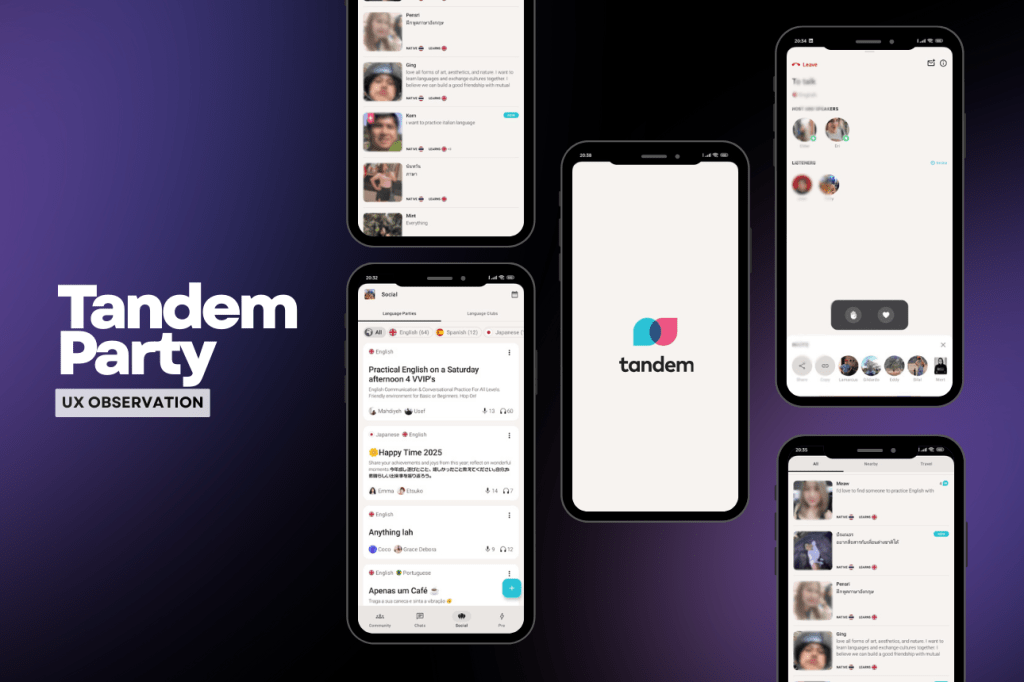
  • A UX Observation from Tandem’s Party Feature

    A UX Observation from Tandem’s Party Feature

    A little flashback.

    I discovered the Tandem app during the COVID era, when staying at home for long periods started to feel frustrating. I wanted to do something productive, or at least something new, and that’s when I found Tandem.

    Tandem lets you learn a language by talking directly with native speakers. You can chat, join calls, exchange cultures, and slowly build confidence speaking with strangers. What made it special for me was the human connection.

    You don’t just see beautiful photos of other countries on social media, you actually talk to people who live there. You learn about their food, traditions, and daily life, and in return, you share stories about Indonesia (and yes, remind them it’s not just Bali and Jakarta).

    How Tandem works.

    After signing up, you select:

    • Your native language
    • Languages you’re fluent in
    • The language you want to learn

    Based on that, Tandem shows a list of people who match your learning goals. In the early days, users could display multiple language badges on their profiles. Now, unless you’re a Pro or Premium user, you can only choose one language per category (native, fluent, and learning).

    Tandem is available on iOS, Android, and the web. If you just want to chat without staying glued to your phone, the web version works well. The UI and UX across iOS and Android are mostly similar, with nothing drastically different. I said that, after using Tandem for almost six years, I’ve started noticing some small but interesting UX details.

    Tandem Party feature

    One of Tandem’s most interesting features is Tandem Party, a group call feature where users can join live conversations. It’s quite similar to X Spaces: there’s a host, speakers, and listeners.
    However, there are a few differences:

    • No anonymous listening option
    • Non-premium users are limited to 1 hour of listening per day

    iOS vs Android UX differences

    From my experience:

    • On iOS, joining a party feels smooth. I tap once, and I’m in.
    • On Android, there’s sometimes a slight delay or the tap doesn’t register, so I end up double-tapping to join.

    Another interesting detail is the filter behavior on the Party page:

    • On iOS, the filter resets after joining or leaving a party. You have to reselect the filter and scroll again.
    • On Android, the filter stays active, which actually feels better.

    So, in a way, both platforms have minor UX issues, just in different places. Hopefully, these small frictions can be improved in future updates.

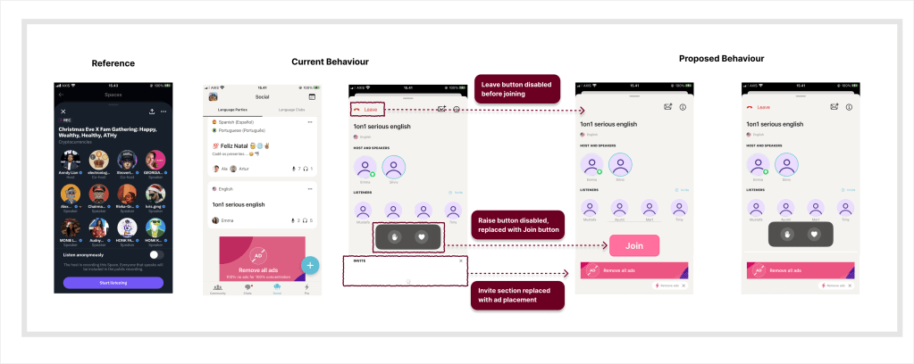
    Below is a simple UX comparison showing the current flow and a proposed alternative for joining a Tandem Party.

    Proposed UX improvement for Tandem Party, allowing users to preview before joining.

    A small UX idea: “Join” before entering

    This got me thinking, what if Tandem added a manual “Join” button, similar to X Spaces? Currently, tapping a party immediately takes you inside the room. But sometimes:

    • I’m not interested in the topic
    • I don’t feel like joining that specific group
    • I just want to preview and leave

    A join button would allow users to exit without entering first, reducing accidental joins and awkward exits. Since Tandem already shows ads, another idea could be placing banner ads inside the party room, without disrupting the core experience.

    Final thought

    Overall, Tandem is a great alternative to apps like Duolingo, especially if you want to learn a language directly from native speakers.

  • Single App Everywhere? Shopee Says No

    Single App Everywhere? Shopee Says No

    While Grab and Lazada offer a seamless experience by allowing users to access their apps across regions without installing a separate app for each country, Shopee takes a very different approach.

    Shopee basically says no to a single app everywhere.

    Hmm… that caught my attention.
    This topic instantly triggered so many whys in my head, haha.

    Whether an app chooses a single global version or multiple regional versions usually depends on its target audience. Some apps are designed to serve users globally, while others focus deeply on localization. In this post, I want to share my experience using apps that operate across Southeast Asia (SEA).

    The first app that feels super useful for me as a traveler is Grab. As a ride-hailing service across SEA, it solves so many travel problems: not knowing public transport routes, avoiding taxi scams, and dealing with language barriers.

    What I really appreciate is that I don’t need to install a new app when visiting another country. Grab automatically switches the regions, while the UI and user flow stay the same as the version I use in Indonesia. Since the payment accepts Visa/Mastercard, there is no problem at all with the payment.

    During a short visit to Thailand, I also explored local e-commerce apps like Lazada and Shopee. Naturally, I chose platforms I already knew.

    This is where I was surprised.

    Lazada works just like Grab. I didn’t need to install Lazada Thailand. I simply switched the region and logged in with the same account I use in Indonesia. That felt like a great user experience.

    But when I tried to access Shopee Thailand, I felt a bit sad : (
    Shopee Thailand wasn’t available in my Google Play Store. To install it, I had to change my Google Play region to Thailand. As an alternative, I searched for a Shopee APK online and installed it manually, not via the Play Store.

    I’m not saying this method is 100% safe, but it worked for me.
    The reason I avoided changing my Google Play region is simple: once you change it, you have to wait one year before you can change it again.

    Shopee and Lazada are competitors, yet they run completely different strategies for regional apps. I read several articles explaining why Shopee chooses to build a separate app for each region. The idea is to give regional teams more freedom to deeply localize the app so it truly resonates with local users. And honestly, they do a great job at localization. Some UI elements and features are clearly different between Shopee Thailand and Shopee Indonesia.

    From a product perspective, this might also make development more efficient. Fixes, experiments, or feature rollouts can happen at a regional level without affecting the global app.

    My final thought? As a user, especially as a traveler, I personally prefer one global app. It feels simpler, more efficient, and more convenient. But I understand why Shopee chose a different path.

    How about you?
    Would you rather use one app everywhere, or separate apps for each country?

    Share your thoughts below.

  • Why Online Shopping in Thailand Feels Easier Than in Indonesia

    Why Online Shopping in Thailand Feels Easier Than in Indonesia

    Online shopping in Thailand genuinely surprised me, especially the payment experience.

    Using QR payments on e-commerce here feels incredibly seamless. I don’t need to input a virtual account number or manually type a bank account for transfers. It’s as simple as paying for street food: scan the QR code, confirm, and done. No copying and pasting numbers, no worrying about entering the wrong digits, just a smooth checkout flow.

    Especially since Thailand receives the cross-border QR, the payments remove so many small frictions. I want to share this experience because, as a tourist, this feature was really helpful.

    I don’t fully know how the online shopping culture works in other countries. But coming from Indonesia, this stood out to me. Most big e-commerce platforms still don’t offer QR payments as a default option.

    In Indonesia, QR payments (QRIS) become popular during the COVID-19 era, mainly to minimize contact when handling cash. Since then, QRIS has grown fast, especially among millennials and Gen Z, myself included.

    I really appreciate apps and platforms that adapt QRIS as a payment option. I hope Indonesian e-commerce platforms like Shopee and Tokopedia will soon add QR payments as a standard option. As of writing this post, Lazada Indonesia has already implemented it.

    Good job, Lazada Indonesia!